Saturday, February 01, 2014

2014 - Workshops in Florida

Sunset painting in Bonita Springs using the prismatic palette

Plein Air study - afternoon

Plein Air painting at the beach 

Plein Air study 

Plein Air study - Bonita Springs

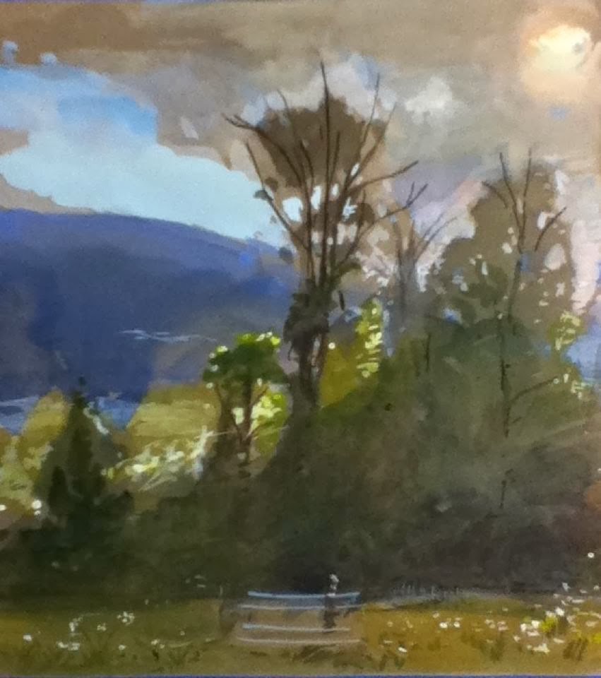
Plein Air study in watercolor/gouache

Plein Air study in watercolor/gouache

Karen painting at the beach
This year, I will be teaching 2 workshops in Florida.  One will be for the Art Center of Bonita Springs, March 17-19, http://www.artcenterbonita.org/workshop.htm. The other will be hosted by Florida artist, Deborah Elmquist, at her studio and surrounding landscape in Port Orange, April 4-7 http://deborahelmquist.com/workshops. 

  Both workshops are combination Still Life and Plein Air Painting.  In the landscape portion, I will be teaching students to mix and use a premixed landscape palette (often referred to as the prismatic palette).  This palette allows artist to interpret and paint atmospheric perspective, quickly, which is very helpful in the fast-changing weather and light effects of outdoor studies. 

 The Bonita Springs class is scheduled for one full day indoor still life (from life) and two full days outdoor landscape painting .  The Port Orange class has the option to take either Still Life (afternoon) or Landscape (morning) separately, or the student can take both for the full day.  

In all the classes, I will be demonstrating each day, as well as helping students individually at their easels, or as a group.  All of my demonstrations are interactive, so that students will understand "why" certain colors and values work, and I show them "how" to simplify by massing into value shapes.  For both classes, students need to bring an outdoor easel.   The classes are intended for oils, but the principles can be applied in any medium.  So, watercolor, gouache, and pastel are an option. 

Friday, January 03, 2014

Museum Visits - 2013


In December, I went down to the Museum of Fine Art in Boston to see the Sargent Watercolor Exhibit.  The exhibit showed over 100 paintings from the combined collections of the Brooklyn Museum and the  MFA in Boston.  The works were from many years, and they did not disappoint!  Painted primarily for his own enjoyment, they give us a view into his private life - studies of friends and family on outings and hikes in the country, or plein air paintings from trips.  

Contrary to what many modern watercolorists believe, John Singer Sargent was not overly concerned with preserving the white of the paper, and he used white paint when needed.   Sargent used a combination of transparent and opaque watercolors (gouache)  to create his dazzling light effects.  The opaque watercolor, or white gouache, was used both under and over transparent washes to hold his lights or build stronger planes of light.  In addition to the gouache, he experimented with wax resist, which could hold a light, and when painted over, the resist could produce interesting textures.  In the second painting down, you can see some of the wax resist to the left of the figure.  In the last photo down, I love the woman on the right, where the sunlight and shadow on her legs are so simply rendered, yet so effective.  Sargent was wonderful at contrasting warm sunny areas with cool areas in the shadows in his plein air studies.


In addition to the many watercolors in this exhibit, there were some of oil paintings, too.  It was a delight to see the one with the artist in his "bedroom studio".  I took a close-up of the sheets.  Sargent used a full brush and depicted strong planes of light with thick paint, painting with knowledge and conviction.  The sheets are a wonderful study in massing.  In the plein air painting, the sunlight smashing onto the rocks in the stream bed and the dappled sunlight on the bank and trees was very convincing. I wish I had taken a regular camera, instead of my ipod (sorry, the photos are grainy and washed out).   

Aside from the actual watercolor exhibit, the MFA Boston has one of my favorite Sargent paintings, The Daughters of Edward Boit.  It is exhibited along with the giant vases that are in the painting.  Here is a picture of me next to a vase to give you a sense of scale. 

This is just a tiny sample of the show, and I would recommend seeing it before the exhibit closes on January 20, 2014.  The MFA Boston is a lovely museum with a fine collection.  The American wing shows a number of excellent 19th century paintings by the Boston greats:  Tarbell, Paxton, Hunt, and Benson, along with numerous Hudson River paintings.  Get inspired! 

Monday, December 30, 2013

More Walnut Ink, Please


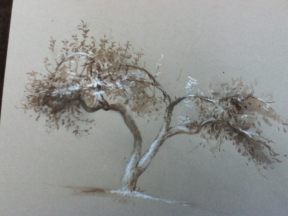
The beginning of November, I got to go down to NYC to see the Rembrandt, Vermeer & Hals Show at the Frick Collection, as well as, attend the Open Painting/Drawing classes on Friday and Saturday afternoon at the Art Students League.  I did not bring oils, but I decided to draw, instead, using walnut ink (which is a lovely brown ink) and white gouache.  The first 2 drawings above were completed in Studio 7 (Frank Mason's old room, now Tom Torak's) on Friday.  Teachers do not come in on Fridays, and you are allowed to set up and use the models.  Studio 7 has 2 models on either side of the room, and it was fun to draw them both within the time constraints.  I mostly use a brush for the ink washes  and  gouache, and I add fountain pen and pencil to help model form or add accents. 

 The last head study was the second drawing I did on Saturday afternoon, also in Studio 7.  The first study was in watercolor, and I decided that it was getting overworked, so I drew this one very quickly, before I had time to over-think it.  

I have come to rely on walnut ink.  It is my "go to" for drawing supplies.  It is great for massing in the shadow areas, and it can be diluted with water for a lighter tone, or used full strength.  I use it for figures and also in landscapes.  It is one of the mediums I use in my Drawing on Nature class, too.  Layering with walnut ink produces rich tones, too, and it can be used with a brush, reed pen, or dip pen.

Monday, December 23, 2013

Difference between uploading with the Blogger App and the webpage...

I am curious to see if the drawings I just uploaded with the app will upload differently from the webpage...so, here goes...It looks like the webpage upload shows the whole picture, which I like better than the picture being cut-off.  What do you think?
Here's the start...mapping in placement idea
Moving along and focusing on light and shade

Developing and modeling 

Saturday, December 21, 2013

Sequence continued...

So, after I lightly sketched, or mapped, in where I wanted the trees, barn, etc. to go, I began thinking about the light. Here is the second picture In the sequence.

I am going to attempt to upload 2 pictures using the Blogger App...


Plein Air Drawing Sequence

If I have the presence of mind, I will snap photos of a drawing in progress.  Here is a progress sequence for another plein air drawing in my gray sketchbook.

Testing the Blogger App

The Blogger App for iPods does not seem to work...I can't seem to upload photos.  Any suggestions?

Looking Back - 2013 - Drawing on Nature

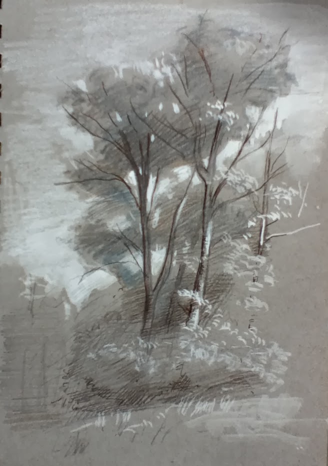
Besides teaching Walk & Watercolor and Sunset Landscape Painting, I taught an outdoor drawing class called, Drawing on Nature.  Each student received a little sketchbook, and we used combinations of pen & ink, wash, and pencils, and heightened with white gouache or chalk.  My favorite sketchbook contained gray paper and was spiral bound.  Again, all of the supplies fit into a backpack, which made it a perfect medium for walks or hikes.  These classes were given twice a week at Smugglers Notch Resort throughout the summer and fall, with all materials included.  The following drawings were some of my demonstrations this year.  The sketchbook is approximately 6"x8", which is a perfect size for sketches.  All of these drawings were done plein air.  It is a wonderful way to appreciate the beauty of nature.  

Here is the little gray sketchbook 

Pen & Ink, washes, pencil and white gouache on light pink paper

6"x8" gray sketchbook -  pen & ink, pencil, white chalk & white gouache

Gray sketchbook - deciding to keep the drawings monochromatic 

Gray sketchbook - combination of pencil, pen & ink, colored pencil & white

Another demonstration in the gray sketchbook 

A little study in brown ink, washes, and pen, heightened with white gouache

Tan paper with pen & ink and brown and blue washes

larger drawing with washes, white, and pen & ink on tan paper

Tan paper with walnut ink, pen & white gouache

This drawing was in the last fall class..most of the leaves were down

Here I am with my little cart and seated on my little folding stool.  

Looking Back .... 2013

Wow! 2013 is coming to a close, and I have barely written a word.  So, what have I been up to?  Teaching, mostly.  I taught several workshops and classes over the past year, and a lot of them were in watercolor and gouache.  This is becoming one of my favorite ways to paint outdoors.  Portability is its greatest advantage.  No easel is needed, the painting supplies are lightweight and affordable, and the paintings can be transported without damage.  Here are a few pictures from a few of year's classes or workshops in Walk & Watercolor or Sunset Landscape Painting using transparent and opaque watercolor. 
Teaching Walk & Watercolor in Bonita Springs, FL

Students painting in Bonita Springs, FL

Demonstration from one of my Walk & Watercolor classes

I love having families take the Walk & Watercolor class

More demonstrations 

My granddaughter helped out :)

Demonstration from Sunset Landscape Painting class

Another demonstration from a Sunset Landscape Painting Class

Thursday, March 07, 2013

Part 3 of the interview...

A couple of weeks ago, when I was thinking about the various ways I have used my artistic talent to remain employed as an artist, I decided to see if any other fashion illustrators had gone into fine arts.  In doing so, I stumbled upon a blog called, Art Fashion Creation.  The blogger had asked a few times about sewing pattern illustrators in a couple of her posts.  Since I had done pattern illustrations back in the seventies, I left a comment.  This, in turned, inspired the blogger to contact me, and her 3 Part article about my illustration days are from a series of "interview questions" via email.

She needed pictures of my old work , so I poured through tons of old illustrations that I had tucked away for 40 years or so (yes, I am a pack rat), and I enjoyed seeing how the style of drawing depends on purpose, as well as audience.  You can read the interview.  Here is a link to Part 3.  http://artfashioncreation.blogspot.com/2013/03/karen-winslow-interview-sewing-pattern.html

Monday, March 04, 2013

http://artfashioncreation.blogspot.com/2013/03/karen-winslow-sewing-pattern.html  Here is Part 2 of the article about my experience as a fashion illustrator.  Hopefully, I got the link right....

Saturday, March 02, 2013

Blog article :)

Here is a link to a blog article about my experience as a fashion illustrator for pattern companies back in the 70s.  Enjoy!  http://artfashioncreation.blogspot.com/2013/03/unattributed-sewing-pattern.html

Thursday, February 28, 2013

www.artcenterbonita.org/workshop.htm  I am teaching a workshop March 28-30, 2013 at the Art Center in Bonita Springs, FL.  All levels are welcome, and we will be concentrating on learning to mass, using still life as our inspiration.  Contact the art center if you are interested.

Also, I will be teaching a  Walk & Watercolor workshop April 1-2, 2013 in Bonita Springs, using opague and transparent watercolor, as well as ink and wash, on toned paper.  If you are interested in this one, please contact me directly.  We will meet at the Village Walk, but we will be painting in several different locations.  


Both classes are from life, and I do lots of demonstrating.   I hope you can join me!